Monday, August 5, 2013

A growing fascination for James Gulliver Hancock

I was on the plane a few days ago...  NBC entertainment came up with an interview of James Gulliver Hancock.
If you have not checked his work...you should!
He is an Australian illustrator that has a unique way of capturing building and places. He spoke how he started capturing the buildings were he had lived. He moved to New York City; and became fascinated with each building and their architecture, which he had to capture on paper.

Visit his work at: James Gulliver Hancock

A spread from James Gulliver Hancock's
book titled: All the Buildings in New York


The image belongs to James Gulliver Hancock 

Wednesday, December 12, 2012

ArtBasel 2012 Miami Beach

This year I found myself revisiting ArtBasel 2012 in Miami Beach, FL. Which was AWESOME! I was able to experience this prestigious art show this year since I'm no longer in college. ArtBasel is an art festival that is held on the first week of december. Looking back on this date, is a date that was very stressful worrying about finals and final reviews...but this year I was able to once again experience the most amazing art show in the Americas. Artist from various countries submit entries and is only a selected few that get the opportunity to show case during this special event. They were more than 2,00 artist of the 20th and 21th century. If you attended the event you were able to see art from various decades. I was astonished to encounter a lot of contemporary artist exploring the use of typography which due to my passion for typography it was a surprise and a delight. I have been a longtime fan of Barry Mcgee and his wife Margaret Kilgallen whom has passed away but her work and her legacy has lived through even until this era. Both of these artist work reminds me of my love for typography and graphic design, due to their linear quality and hand-painted signs. 


Barry McGee (Pimple)


Barbara Kruger


Chuck Close: Brad Pitt


Josef Albers


Type exploration from Below


Type exploration in the case with lights


No


Scream


User interactive Pieces


Thursday, November 29, 2012

Prepress tips for designers article

When I was looking into some information about prepress printing and this article showed some great tips for any graphic designer:

Prepress tips for graphic designer

When you design artwork for print, standard practice is to send a PDF to your printer. But are you 100% sure you got the settings right? Are you confident the size is correct? Have the colours been set to print standards or client brand guidelines? What about font usage?
So many things can go wrong, costing you and your client money. So to help, Sigurdur Armannsson — art director at the Icelandic Ad Agency — has prepared these 16 prepress tips that cover the major aspects for correction in your artwork. By checking each tip as you go your file will be in excellent shape for sending to the printery.

boxed typeset
Photo courtesy of Cybjorg 01. File the job into a tracking or accounting system
Every business needs a tracking system where information about the client and his or her jobs are filed. Systems range from high-end business software to simply using FileMaker or similar to store information. Freelancers should also use something that takes care of this. I use iBiz.

02. Use files and folders that bear the job numberTracking systems create running numbers. You should use them for your files and folders too. The running numbers act as keys to further information about every project and client, and save you from creating new files and folders for every job. You could use abbreviations or codes for your client and then the number and a short descriptive name, e.g. ABC 12345 Brochure Spring 2010

 03. Stamp the artwork: Put information inside the artwork. If the client does not object, put a short line in small type 4-4.5 pt., inside the artwork, on the back of a brochure. Include your companies name, the job number and a date. MyCompany ABC 12345 10/09. The name of the printery would be a good addition too. This will help identify the work later.

04. Make it clear who is responsible for the design: Before you start, make sure you have a design brief. What is the main purpose of the design? What are the clients motivations? Who is responsible for the job? An art director? You?

05. Proofread:The odd thing is that clients can be calm about minor errors in the design, like lines not being of same thickness or such. But errors in text are fatal. Use a good proofreader. If the client wants to proofread himself, be sure to have that in writing. An email is great confirmation.

06. Make the artwork the correct size:Does the design brief specify the size? Have you checked Document Setup again? Or the outmost frame in Illustrator? Is everyone using 210×297 as Width by Height? Did the client say an A4 because it looks like an A4 or is it 220×286? For ads, contact the magazine or website. They will love to hear from you. Always double check if you aren’t sure.

07. Define bleed and trim marks in the file:Bleeding — the distance the artwork needs to extend beyond the final size of the artwork — can vary. 3mm is most common. In some cases it may not be needed at all, nor the trim marks. Clarify before you create your PDF, and open the PDF afterward to check inclusion.

 08. Ensure the typeface(s) used correlates to the clients corporate identity manual: Are you using the correct typeface for your client? Are there any unnecessary fonts that shouldn’t be included the file? In Illustrator check Document Info or Find Font… and in InDesign Find Font… under Type in the menu. When delivering artwork as a PDF there is normally no reason to outline the fonts.

09. Ensure logo usage correlates to the corporate identity manual: The client loves her logo and usually wants it bigger than we want it to be. Stick to the size in the manual or the size used for recent works. If she wants it bigger have that in writing and be sure to tell her if it’s overshadowing other information.

10. Keep the color of the logo in the right format for the media used:For print, use the logo in vector format if possible. Logos sent to you inside Word documents are no good unless the design is for web or a PowerPoint presentation. Make sure the colours of the logo are in accordance with the corporate identity manual. For print, the format should be CMYK, not Pantone unless the work is going to be printed with spot colours.

11. Keep the color of the artwork in accordance with the media used: Now, this depends on what kind of colour workflow you will use. For CMYK workflow, all colours should be in CMYK. Pictures should be in CMYK, colour separated for the paper used. No colour profiles should be attached to the pictures. If you are still using pictures as EPS it’s time to switch over to using native Photoshop files. The reason: If you are using transparency in your artwork, like drop shadows or transparent type or colours, your PDF will most likely have torn the photos into strips. This can be avoided by using the pictures as native PSD.For RGB workflow, you can still use CMYK colours, except you should have all photos in RGB. It’s important to have all photos in RGB and they should have a colour profile attached. Use native PSD — it’s great, and has options not available to other formats.If you are including Pantone colours, make sure only the colours used are in the file. In InDesign and Illustrator, go to the Swatch panel and in the fly-out menu choose: Select all unused and delete those colours. If in doubt, contact your printer. He will love to help you and he will most likely send you the correct settings for Photoshop that fits the jobs going to his printery.

12. Color correct your monitor every four weeks:There is no way you can use either CMYK or RGB workflow with confidence if your monitor is not colour corrected at least every month. Colour correction software like iOne has a reminder built in.

13. Ensure all pictures are the actual size shown: Pay close attention to the resolution of the pictures used. Most common resolution is 250-300ppi. You should try not to enlarge or minimise pictures by more than 20% of the original size. This is just a thumb rule. When you change the size inside your document you will change the output resolution too. A 300ppi picture will be 600ppi if you minimise it by 50%. Way too high a resolution. Enlarging too much might get the resolution below what is needed to pass the printery’s preflight.

14. Preflight the artworkPreflighting the artwork before sending to the print shop is a must. If you have done all the things mentioned above, you have manually preflighted a great deal of what is needed. Using a preflight program like FlightCheck from Markzware or similar will help further. It’s most annoying to discover just before you deliver your work that it’s not in line with necessary printing standards. If you don’t have a program like FlightCheck you can go far by using the built in document info and preflights.In Illustrator you have Document Info. Turn off the default Selection Only and browse through the items in the list, one by one to see what’s inside your file.InDesign has a preflight feature. In CS4 it has been moved over to Window > Output > Preflight. There you can see an overview of the document, check fonts, links etc. Also, in CS4 you can see the red or green dots at the bottom of the window that indicates various errors you may have in your file. Great help but it doesn’t beat a professional application like FlightCheck.

15. Ensure the final PDF is high resolution: Did you send your client a low resolution PDF earlier in the day? Did you remember to switch over to a high resolution output? Are you using the built in PDF settings of InDesign or Illustrator? Ask your printer for PDF job settings. The built in settings are usually not what is used for professional PDF output. Or at least know which of the built in settings you are supposed to use.High Quality Print and Press Quality settings are tempting to use if you want quality (because of the names), but in most cases you will have to use PDF/X-1a:2001. Consult your printer here. They will love you.

16. Have artwork approved as final: Get in writing (preferably email) a client approval before the job is sent to the printery. Or in bigger agencies the approval has to come from an art director or account manager. Verbal communication cannot be relied upon if something goes wrong.These 16 pointers may seem overwhelming at first. Don’t fret, because when you’ve worked through the steps a few times they’ll become a part of your prepress routine. You’ll be able to quickly run through the list and discover that you’ve covered almost every one while working on your design. Once again: Talk to your printer to get the best results.And finally, here are the 16 tips without the above explanations — you can keep this handy since you already know what they mean:

File the job into a tracking or accounting system

Use files and folders that bear the job number

Stamp the artwork

Make it clear who is responsible for the design

Proofread

Make the artwork the correct size

Define bleed and trim marks in the file

Ensure the typeface(s) used correlates to the clients corporate identity manual

Ensure logo usage correlates to the corporate identity manual

Keep the colour of the logo in the right format for the media used

Keep the colour of the artwork in accordance with the media used

Colour correct your monitor every four weeks

Ensure all pictures are the actual size shown

Preflight the artwork

Ensure the final PDF is high resolution

Have artwork approved as final

Saturday, November 17, 2012

Life beyond 600/ Beyond the Fold

As new devices appear we sometimes wonder where does the fold exist? Is it still at 600 px. I came across this article that gives a nice idea about the life beyond the fold.

http://iampaddy.com/lifebelow600/

Wednesday, April 4, 2012

Le Corbusier Urbanism [Karen & Loren]

Our approach for the design was based on Corbu's philosophy on creating a modular grid set up of a city. He envision a modular plan of a city such as Paris and his solution is resolving the chaos and disorder of the city. With the use of the a mobile device the user will be able to engage and contribute to the exhibition his thoughts about the experience. As well as the use of a table like surface were viewers can explore and engage with a 3-d rendering of Corbu's 3 million inhabitant model.


Friday, February 17, 2012

Monument to Human Perseverance

Perseverance Vi Karen


Tuesday, February 14, 2012

Tuesday, January 24, 2012

Plum Job

I am...

A designer, an art historian and from time to time a fine art artist. Born in Colombia and raised in south Florida, it was due to this migration which my examination of communication began. Upon closer study, various ways of communicating became apparent as well as my own personal struggle of learning a new language and adjusting to a different set of customs. Growing up in South Florida, an eclectic city composed of individuals from different nationalities and cultures motivated me to study at an art magnet in Miami called Design and Architecture Senior High. School which offered all design disciplines such as fashion design, industrial design, architecture, film and fine arts. Visual communication was the one that stood out for me, as a discipline which answer all my inquires that for so long I was seeking . Through these years, my exploration of layers began as well as interest for fashion. My exploration of layers started very literally through collages but my inquiry in understanding communication did not stop through my years in high school. Studying at the Kansas City Art Institute, I began “peeling the layers” and understanding various design principles and the core of communication.


I’m an individual that sees beyond the layers & implements this knowledge in design solutions

I’m a graphic designer and art historian who understands the importance of research, process and user interaction. I have explored layering in three areas: analog, digital, material and information. Whether is collage, using overlay, or materials like vellum; these processes emphasize various elements in my concepts. Layers of information can be organized through systems, websites and creating user interactions, it is through reveals one of many methods to tackle large amounts of information.

Seeking

Searching for a place whether is big or small, or across the globe. I need a place where it’s inspiring, diverse and were many of my skills will be used not just print but hopefully others like screen based design work. Versatile in the work or clients they have giving me possibility to work in various projects ranging from brand identity , packaging to environmental design.A place where I can be a socializer working with multidisciplinary teams, and hopefully a diverse group. Working along side talented and world class communication and other types of designer wether is industrial designers, strategist or others that I can gain knowledge from.


How I’m going to get there....

-My high school teachers, all of my professors have worked with various recognizable studios and organizations across the globe. Therefore a large portion of my connection were developed there.


-Friends and peers due to my high school teaching various principles.Many of my friends went to different schools such as RISD, MICA, SAIC, CCS, Otis, Art Center, CIA, SVA, Parsons, FIT, Central Saint Martin. Old classmates work or know of various industries seeking for new employees which gives me the opportunity to make more connections as well as a higher chances of


-Faculty at KCAI as well as through AIGA KC I been able to make several connections. Including people from various local studios such as Pixels, Propaganda 3, T2. Participating in other venues that AIGA KC has hosted such as portfolio day have been other ways that I could get more connections and therefore adding to my network.


-Behance, Coroflot and LinkedIn have been other sites where I have been either contact or I have been able to see job postings around the world from various studios that hopefully match my interest and my skills.


-Through my brother, Angelo is a source where I have gained a great deal of my connections of people in the automotive industry, which might be a possibility of interest in the near future.

-Making my web presence more dominant and my portfolio more accessible in different portfolio sites, in order for more professionals to stumble upon my body of work.

Monday, October 31, 2011

[karen] phase3

These are the touchpoints for 405 Peak, it’s objective convey an essence of modernity and a fresh approach to the act of wine tasting. The identity will speak to a younger audience with a credible, modern, friendly and fun attitude.
The inclusion of the user such as in the business card and the coaster reference the friendly attitude and the casual environment. As well as the inclusion of the color orange to make the overall feel more energetic and fun. There still work needed to be done.

Karen[Phase3]


Edited: Ipad: AP Biology scenario

Sunday, October 16, 2011

Ivanhoe Brandmarks and Signatures: Four Quadrants

Before the presenting to the Beautification Committee at Ivanhoe; Julie , Ian and I decided to explore with our brandmarks three different concepts : the sunburst, the community and the four quadrants. I took the role to develop various barandmarks, logotypes and develop signatures for the four quadrant concept.

Brandmarks & Color palette


Signature

After meeting with Julie and Ian this one appears to be the most successful , containing the best concepts and the idea is the one below. These are the elements that will be presented to the Beautification committee, on monday.


Friday, October 14, 2011

Ipad and Iphone

Scenario 1: The use of the ipad in this scenario, is to help the ESL high school student Carlos with his AP Biology lab.


iPad Presentation


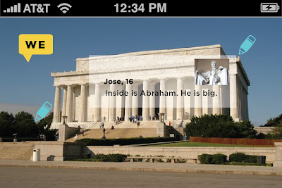
Scenario 2: Practice English on the go, Calos visits Washington D.C and he is able to use his iphone and the feature of augmented reality in order to learn about the US and increasing his english vocabulary.