Monday, October 11, 2010

Logo Build Story Board


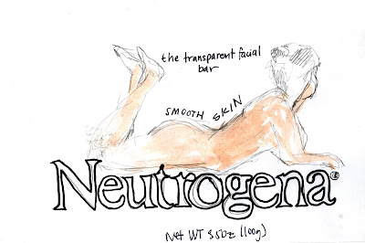
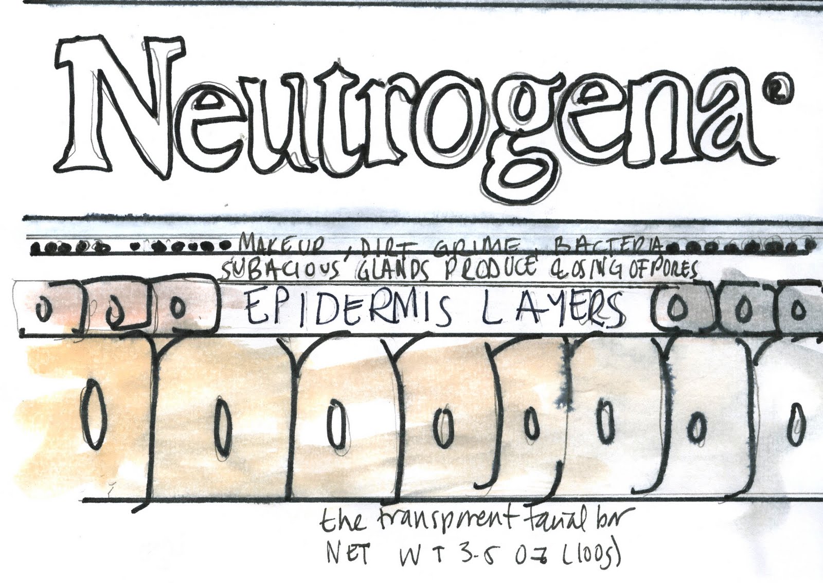
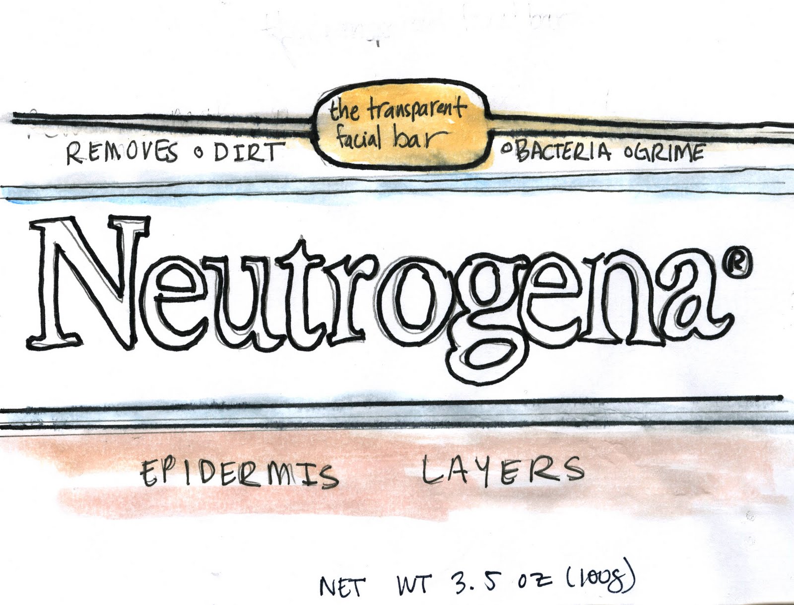
After meeting with Ian, Bethany, Loren and Keaton and reflecting on my story boarding for my 5 second-logo build they all felt that I should have the elements run into the stage. A couple of my ideas involved the breaking apart all the elements yet for the context and in the context of human it will look like some dismember. Keaton also suggested the use of opacity and overlay as a quality of speed.

Friday, October 8, 2010

Mike McCoy Lecture

Mike mcCoy an industrial designer , discussed the approach of product design in the 1990's which was more or less the making boxes and shoving new products in it, later it became about communicating through the form. Break through came about in which product design, from which the design broke from the format of the box and became more expressive. Product semantics which is the meaning of form; a very experimental stage. Design research , not making extreme but how the user interacts and the function in a daily basis. Prototyping showing an idea physically in a short amount of time. Graphic novels the style that he feels that is more compelling to show people interactions and situations. People centered design: implies the social nature and community of design. For example airport, emergency room, navigation on the subway they are design without considering the experience of the user. People centered design tools for understand and improving the experience. Ways of looking framework: activities, environment, interaction, objects and users (AEIOU) Is more of a checklist when design something complex in order to focus on the experience of the user. Analytical scenarios, you can place in this graphic novel, interaction and you can use profile and factious characters as a way to guide the user. Storyboards and ways of invision , the innovative is how is going to be seen. Design is like a zoom lens, the designer can remove the block shifting perspecitve really fast from deatil to the whole composition. Projections: they way you present it your concept and allows for idea to be visible. Scenarios: team building tool-storytelling: analytical tool: observations shadowing, it allows to test things quicker even at prototype stage. Having rough ideas allows for quickness in brainstorming and the importnace of testing and making sure of the user experience.
Something that he spoke was about the quickness of prototyping to make sure you consider the user experience and when I get to prototyping stage of our products I will definitely consider in the process of making the mock -ups of the Neutrogena product.

Neutrogena Graphic Approaches

In discussion with Julie Sikonski the different approaches in rendering our concepts these methods came to mind:


Logos; vector shapes; computer typography, hand rendered typography; photography, simple colors and images, adding cut outs to see the packaging,


Ethos; photography, illustration, scanning, a strong logo, metallic colors (metals), engraving, recycled packaging or labeling, gold leafing,


Pathos; water color, painting, photo collage, illustration, photography, screen printing, super bright and bold colors, sewn pattern/container, pattern making (hand or computer), computer based illustration.

Mailer Bodoni Prone to Akzidenz Final Design


outside
inside


Monday, October 4, 2010

Project 5: Combined Narrative KC Pro Health Community Runners

Project 5 : Combined Narrative from Karen Villalba on Vimeo.


The two combination of text and voice to create a combined to give more information about KC Pro Health Community Runners. Through the process of combining these two elements so that they worked together taken into account the critiques given to each of the individual channel. On my last project 4 in which I used text jogging into stage yet the up and down movement was not evident and in this this refinement of the channel I tried to add that motion to create the effect of running more evident. I had some brands in my previous version but on this version the words are all generic and terminology for runners wardrobe. I added "spandex" for a second individual to be on the stage since it suited the sound considering that they are two different people speaking through voice my other channel. I learned through this process the value of editing considering what was important or what the information that I wanted people to hear, considering that my sound piece was a 41 second clipped and then my text a 10 second. In my sound critique was mentioned that I should remove the second mentioned of "the cute guys on the trail" which I felt that in my final piece it made more concise. The relationships created using both of these channels in my animation, allowed for the words depicting wardrobe to have a meaning and with the dialogue give the impression of 2 people running on the trail. My text animation was very simple and therefore by having audio and explaining the role KC Pro Health Community Runners which allows for networking and safety and is easy to join that is even accessible on their site. The color of the text was to reflect both of feminine voices that are heard on the sound selection.

Neutrogena & It's Appeal

After my concept exploration the product that I will be focusing through these weeks will beNeutrogena the transparent facial bar with Net Wt. 3.5 OZ (100g). Based on the thumbnails that were made before, I have made some refined and sketches and concepts have been made. The intended audience for this product is mainly women but it's use as a product is suppose to attract men and female since is a facial cleanser, since bad skin affects both sexes. Neutrogena is also supposed to attract younger people since they are ones that usually have troubles with her skin.


The concepts that have been developed are :

PATHOS

1. Reflecting Neutrogena as a sexy woman that has been captured as she is about to step to bath. In pushing this idea further I will like to take some of the fluidity of the art nouveau and the organic style to reflect the organic , natural sense of skin, smoothness that Neutrogena is promoting through the use of this product.


2. Another concept is the using a clear sky or other "full bleed clear elements" as a way to reference clear skin. By making this connection the consumer can think of something to think of the idea of clear, clarity, purity that you are supposed to experience of your face after using the transparent facial bar.

Other clear, purity, clarity full bleed concepts are :
1. sky
2. glass
3. water
4. erase
5. lilies
6. crystal
3. The washing face since is this product sensation and feeling of fresh skin happens during and after the use of the transparent facial bar. Is the splashing of water and the submerging of the face in water.

LOGOS

4. Reflecting the layers of the skin and give information about glands and clogging of pores. Using the structure of their logo as a banner an in a logical way explain through the package to the consumer the facts about why pores clog and the layers of the skin and where it happens.


5. How-to of using Neutrogena's : transparent facial bar. Just reflecting the steps in a step by step process.

6. By showing a problem skin and Neutrogena being the logical solution. Logical explains that acne is an issue and Neutrogena's facial bar has the solution in removing the blemishes. In continue further with this idea to keep in the "logos" appeal with out evoking any emotion I will have amore abstract approach to this concept.


Saturday, October 2, 2010

Advertising Is A Powerful Tool For Selling Ideas Focus in Benetton Brand: Readings Mira Kalman and Benetton&


In both readings it brought emphasis to the importance of image and the emotional effect that can have on the viewer. On the first reading, in which was written by the wife of Tibor Kalman even though he didn't considered himself a designer; but he was a editor and a journalist. Tibor strongly believed in exposing moral and political issues. He knew the power of an image in a short time span. Tibor in collaboration with Oliviero Toscani helped created campaigns for Benetton clothing company.


Tibor came across this black and white picture of David Kirby a 32-year old from Ohio, dying of AIDS. This image was published on Life magazine in November 1990.


By having it color it gives the image a feel of an ad rather than being just a journalistic photo.

Tibor believed in the photograph being an universal communicator. Final Moments (above) creates a dialogue between the viewer and brings forward the issue that is affecting society which is the epidemic of AIDS. In the second reading in which the ad's of Benetton were discussed, is evident the power of imagery and it targeting the audience values and concerns of the viewer. All of Benetton's campaigns, don't target the consumer but the individual. Benetton uses the cycle of difference, reality and free speech and the right to express it.
The cycle of difference is evident in Benetton's 1986 campaign in which in the ad's reflected a pairing of stereotypical people whom were different, due to their race, beliefs, political, moral making his ads very controversial and bringing a new style of ad's in the field of advertising.


In the cycle of reality, Benetton ad's added a "realistic" or "real life" a depth of field it's way of communicating change radically; it is evident in its February '92 campaigns. The photos used portrayed the "real" world. In this groups falls the ad "Final Moments" the AIDS ad previously mentioned by Tibor Kalman. All the image s depicted high-drama situations, a man dying of AIDS, a soldier holding to a thigh bone, a man assassinated by the mafia, a car on fire and ship being overtaken by emigrants.
The cycle of free speech and the right to express it, Benetton definitely gave the "shock value" to it's viewers. Benetton was accused of not having the legitimacy position to bring all this issues in such a wide spread media to the viewers. Through time the brand has worked with many organization in helping and providing funds by which awareness or by providing advertisements the public becomes more involve with the cause. Benetton uses images that reflect conflict and pain, this brand really breaks from the stereotypical of advertising which reflects the idealistic comfortable world.

After reading these two informational items, I'm going to take a good observation in my imagery and since people have short attention span. Benetton has been very successful with their selection of imagery and affecting the emotional pleas of their audience.