Showing posts with label Visual Communications II. Show all posts

Friday, July 16, 2010

The New York World

This summer I was able to go higher on statue of liberty and enjoy the small museum inside the statue of liberty in New York City. They had jornals, visual media to promote the unveling and the importance of lady liberty.

This set shows the different iterations that were used to describe The New York World. It was interesting seeing the different versions and the combination of text and image and using the statue liberly and replacing the later versions as New York and making it the icon that until now it has been a landmark of New York.
This flyer used the Statue of Liberty an icon of liberty and welcoming immigrants
as an indicatior not to stay and leave. The use of text and the gesture indicates
and mandates people to leave the country and to make America a better place.

Friday, May 7, 2010

Review Proposal


For my final review , one statement that i can synthesized from all the classes is the one of the first quotes that was said on the first day of class in Visual Communication in the Fall '09.
in which it was said that the "Principles are used by designer to turn disparate elements into a cohesive whole." These elements are type, image, color and how these work together to give meaning and either relay or anchorage meaning as seen in the spring '10
I will like to demonstrate the importance of layering and how this principle has been used through out the year. As seen in our first project the dot book the imposing of text over image and their reflection in meaning. As well in the delineation drawing of color and drawing and form this dimensionality allow for letter forms to come forward or recede in space. In the spring the last project in Image for the National Geographic the emphasis of this formal quality was not only evident as a medium through the use of transparencies but also as the concept of the earth and the relationship of layers; the use of colors and their of set was vital in order to obtain the right mixing of colors. Layering is also evident in the identity exhibit system.

The process of layering was a very important element through out both semesters also in my change one thing poster in which collaging played an important role as well as my identity project. The layering and collage was also evident in the marilyn poster but also dealing with the saturation of colors and the relationship of colors such as triads and complementary colors and the mixing of colors, a technique learned in the fall'10. The addition of layers not only allows for dimensionality but also for more embedded meaning.


.


The importance of image embedded with meaning and the relationship of text has a fundamental objective throughout the year. that as a graphic designer one acts as a mediator or a guide to the general audience. The importance when text and image worked to together, in a fusion. Or in separation or fragmentation when image and text disrupt each other which was more evident through the use of relay and anchorage. In my taxonomy, the use of text worked in a relay because even though they were marks they connotative a different meaning. Which is also evident in the identity project of the spring in which the icon and subject act upon a anchorage and relay beasis between the image and text. Text can work in the same way by the use of font face it either works as anchorage or relay. Which in my identity they worked in anchorage since they are taking from the same material or medium and their placement is also brings to mind the vision of media.


Wednesday, May 5, 2010

Final Reflection : Icon Set and Identity and Linear Process

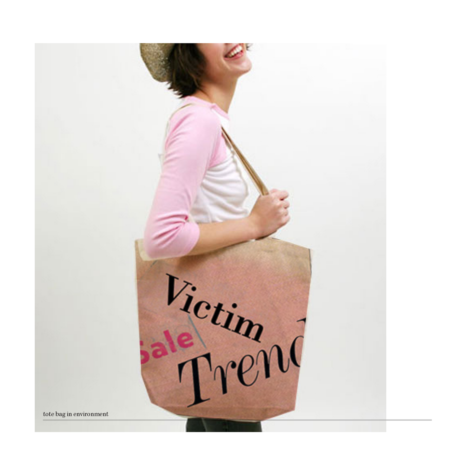
Through the process of creating visual relationships between the word and icon through the use of anchorage and relay. I found one of the process, by scanning images from magazines as a source and inspiration for my final identity. Through this process I tried to three different visual stylistic approaches to the application of my merchandise. I also added 2 merchandise components a bumper sticker and a tote bag, I feel that these objects not only portray the bombardment of media to shop just like the traveling of a bumper sticker through the roads and a tote bag not only attract feminine audience but is also a fashionable product that applies to my exhibit.
This exhibit talks about the trap about the fashion industry, the bombardment of the media and the effect on the audience to consume more therefore becoming a victim and falling in the trap. After the different approaches to the application of photo, word and background, pattern and word and the replacement of the icon plus word. From all these different attempts the one that really works by texture and is in the stylistic approach of media, the use of magazines even it's textural component , the dots and the use of imagery. I also decided to use text that I found in magazines . I still use the words that I came about such as VICTIM, SALE, TREND, BUY? . This words, are words that we hear often at shopping malls.


LINEAR PROCESS

The idea for my final exhibit it came from a combination from the anchorage and relay exploration.


anchorage


By the collaging of a magazine to emphasize the function and location of the clutch I discovered that through this process it will be suitable , to make the relay about the fashion industry. I also need to add a background and a word. I explored different backgrounds:


The first one being the background that suited with my colors and they were all taking from magazines.
bumper sticker

shopping bag

The use of the bag as a placement of money and wether you considered purchasing an item and the action I felt that the word Buy? would be suitable to go with my icon and these are some example in which I applied the combination of image, icon and word plus background. Then applied it to merchandise such as the shopping bag and bumper sticker .