Monday, October 31, 2011

[karen] phase3

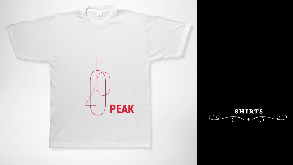
These are the touchpoints for 405 Peak, it’s objective convey an essence of modernity and a fresh approach to the act of wine tasting. The identity will speak to a younger audience with a credible, modern, friendly and fun attitude.
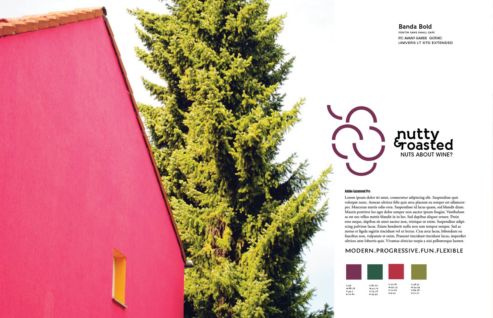
The inclusion of the user such as in the business card and the coaster reference the friendly attitude and the casual environment. As well as the inclusion of the color orange to make the overall feel more energetic and fun. There still work needed to be done.

Karen[Phase3]


Edited: Ipad: AP Biology scenario

Sunday, October 16, 2011

Ivanhoe Brandmarks and Signatures: Four Quadrants

Before the presenting to the Beautification Committee at Ivanhoe; Julie , Ian and I decided to explore with our brandmarks three different concepts : the sunburst, the community and the four quadrants. I took the role to develop various barandmarks, logotypes and develop signatures for the four quadrant concept.

Brandmarks & Color palette


Signature

After meeting with Julie and Ian this one appears to be the most successful , containing the best concepts and the idea is the one below. These are the elements that will be presented to the Beautification committee, on monday.


Friday, October 14, 2011

Ipad and Iphone

Scenario 1: The use of the ipad in this scenario, is to help the ESL high school student Carlos with his AP Biology lab.


iPad Presentation


Scenario 2: Practice English on the go, Calos visits Washington D.C and he is able to use his iphone and the feature of augmented reality in order to learn about the US and increasing his english vocabulary.


Sunday, October 9, 2011

3D Modeling & Design Direction


Ray and I decided to create a model that reflected the news feed that the user of our community can tailored and set in his settings, allowing him to just have a newsfeed of the users that he selects from the particular rooms. An ESL high school student in our community will be mainly interacting with 4 groups: the students in his online class room, friends, experience ESL students that have experienced and share their knowledge with these students whom don't know much about the language or the customs. The last group they interact will be the ESL teachers, that will help them acquire the knowledge for them to compete with mainstream students.

First Design Direction


Second Design direction


iPhone


Friday, October 7, 2011

Strengthening Ivanhoe: Part II

Strengthening Ivanhoe Keynote Copy

Tuesday, October 4, 2011

[karen]"phase2final"

[Karen] "Phase2 Final"

The existing brand is called Wines by Jennifer, a wine boutique located in Parkville, Missouri. That provides customers with a unique wine tasting experience, allowing their clients to test wines from different regions of the world. This boutique is located in a house, which its relaxed environment allows for testers to feel like they were just at home. The rebranding of this establishment will involve renaming it to make it more accessible and up-to date, focusing the branding to have a younger audience to visit the establishment. The goal of my design is to convey a sense of modernity and a fresh approach to the act of wine tasting. The identity will speak to a younger audience with a credible, flexible and progressive attitude. Making wine tasting a fun and welcoming experience.


The three directions from my rebrand are 405 PEAK, Bottle Shock and Nutty & Roasted.

The one that I feel best represents my design objective is 405 PEAK, this brandmark is modern, fun, credible and friendly.