Friday, April 30, 2010

vectoring of DVD cover

With Ray we have decided to take a vector approach in the front we hope that we the layering of transparencies or see through and see the earth (dvd). With this approach we can visibly draw the layers of the atmosphere and to the core of the heating. In our discussions with tyler the heating of the core seems the most dominant , we think we have solve the solution to this design problem by drawing more bands. The book jacket we want it to unfold and we are considering the making of the whole poster through printing it on a transparency.

We have decided to deal with layering to represent the overview of the earth, by having an interactive component in which the viewer sees through and removes each layer therefore revealing the next as is a evident in the movie to call to action that we the viewer needs to play a role in saving and reducing our consumption so the earth doesn't heat up.

Wednesday, April 28, 2010

Six Degrees Could Change the World Sketches


We have sketched different ideas the first idea is to use the carbon dioxide molecule as a design element but also to talk about the issue at hand. The second idea that we are exploring is the concept of layering and how the overall images interacting with each other might look. We will like to deal with the round and sphere of the earth. We also talked about masking images into bands or rings to separate the good and the bad ( in creating the cause and the affect from good and bad between the effects of global warming). We both feel of doing something interactive. Today I found a poster of national geographic and they way it fold maybe that could be the book jacket and transforming into a poster.

Anchorage VS Relay


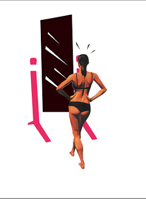
relay : talking about body image

anchorage : indexical of the mirror and it's function

relay : body image


anchorage: the use and function of the bag
relay: the use of lipstick is not just for the lips but is the mark that leaves behind or trace

Louise Fili: First Round of Posters


I tried to focus on the elaborate areas of Vanderslice, but the the text is not really incorporated it just looks like it's added. Hopefully o the second round I can have a better dialogue between the image and the text.
On the second round I'm going to try a vectoring approach and perhaps it should look like a label.

Tuesday, April 27, 2010

Project 5 : 6 Degrees could Change the World


Project 5 we are working in partners and I'm working with Ray Alvarez. After watching the film Six Degrees Could Change The World by the National Geographic. We have decided upon two ideas in which are the main topics of the movie dealt with carbon dioxide consumption, cool and dark. After our talk we have decided to create a couple of sketches and then decide which direction.

Saturday, April 24, 2010

identity and applications


For the application of my logo in this Smithsonian Exhibit I will like to explore the idea in which the exhibit talks about the negative side of being a consumerist and the influence of fashion and the tendencya nd advertisement to consume I will use words such as :
SHOP
SALE
CLEARANCE
DISCOUNT
VICTIM
FASHIONISTA

This words have we not exposed but we have been victims of it's "trap".

The title that I will like to use for my exhibit is :

Under the Label: The secrets of the Fashion Industry


Three different approaches I explore where the use :

1. collaging from magazines, their interaction with my icon plus the word : this process I feel that connects more to my subject and with the style of imaginary that we are constantly bombarded to promote fashion.
2. pattern, word and icon
3. word but letters replaced by icons, plus a textured background

1.


2.


3.


Wednesday, April 21, 2010

museum exhibit title ideas

1. Fashion and it's history
2. Socialites and parties
3. Glamour: Coco Chanel
4. Body Image : Factors and Results
5. Fashion Industry Secrets Reveal
6. Art of Seduction
7. Retail and Consumption
8. Little Black Dress: From Coco to Audrey
9. Fashion Marketing Conspiracy
10. From Fabulous to Thin: Fashion Tricks

Monday, April 19, 2010

revised patterns

Screen+shot+2010-05-05+at+11.46.58+PM.png


Screen+shot+2010-05-05+at+11.46.39+PM.png


Screen+shot+2010-05-05+at+11.44.31+PM.png


lace inspired

Screen+shot+2010-05-05+at+11.44.00+PM.png


These are some examples of my revised patterns, based on my discussion with Ramzy and Laura and my class. I have decided to create an interlace feel especially the one with shoes and the rose icon. Or playing on a parallel relationship, between the dress and hanger , playing of the context of the icons in relationship to the other. I like the last pattern yet the icon looses any kind of recognition.

Thursday, April 15, 2010

reading response 09: Visible Signs and Two Symbols in One

In the reading the Visible Signs by David Crow he discusses three messages the non-coded iconic message and how anchored and relay work in reading images with text. The non-coded iconic message and medium can't be separated from message. Barthes informs that "parasitic" -message on an image designed to quicken the reading with additional signifiers. In the reading it talks how text on image and can function as anchorage or relay.
Anchorage directs the beholder through a number of possible readings to an image. A "floating chain of signifiers" : the text answers " What is it?" The text helps the reader interpret the signifier they are presented with, there is recognition. Anchorage has a repressive value in the inspect of the image.
Relay is less common, text is a snippet of dialogue and works in a complimentary way to the image. It can be found in comic strips and in film. The text supplies the image meanings that are not found in the image themselves, just like in film dialogues.

The second reading Two Symbols in One by Adam Morioka he talked "fused metaphor" to create more interesting designs in which you use a combination of symbols. Combines symbol A and symbol B to produce a different result.

Wednesday, April 14, 2010

first round of patterns and critique by Ramzy Masri and Laura Berglund


Based on the critique that we had today with two senior Ramzy Masri and Laura Berglund, two major things were discuss that I should play more with scale and enlarging my icons because at a smaller scale they loose their main element and the quality of the icon. Another thing was the combination of different icons to make a more conceptive theme. Also that I should look at lace and their pattern to create a more feminine feel and intimate.

Special thanks to Ramzy Masri and Laura Berglund

Tuesday, April 13, 2010

reading response 08 : pattern

In the reading by Ellen Lupton pattern making is found and various cultures. By using one of our icons or various by using this single element in different schemes one can create endless variations, building complexity around a logical core. In the process of creating harmonious or amplified patterns, the complexity was evident due to the arrangement and the repetition and the scale of that of single icon or element. Looking at various cultures like Asia and Africa they work pattern to the endless possible possibilities such as the kente and adinkra in Africa.Patterns can be formally structure or organic regularity. The basics for patterns are isolated elements, linear elements and criss-crossing or the interaction of both. Isolated elements are like our single icon , yet when they are arrange to create a linear path the create linear elements and then the crisscrossing of a single element or more than one element is the last example. Through repetition of the elements and , changing, color, scale and orientation can create regular or irregular patterns.

kente ( africa)

adinkra (africa)

Monday, April 12, 2010

final bok covers and reflection


The final idea was to used the hands to reflect the actions that describe the title of the book, the main subject in my covers is the woman . For the first book as shown above I used woman posture and how she gracefully clasps her hands as a way to reflect the posture of the woman. The second book she has a dialog in regards what clothes to wear, and the third book deals with perfume and the places and locations where you will place perfume , on the top registrar in reflects the the placement of the perfume on the wrists. On the last book I dealt with relationships in which the inclusion of a male figure is introduced and that interaction between man and woman. All books are divided between two registers, in which the is divided by lace and pattern that i felt portray a woman's touch . I felt that these books are directly targeting women and that is what I want to portray by the use of this pink color. I can still work on the fragrance book and how to be a lady I feel that those are my weakest books of the set.

Sunday, April 11, 2010

Friday, April 9, 2010

Project 4: Louise Fili


The designer that I was giving her name is Louise Fili and she has been a source of inspiration for this new project in creating a poster for a "lecture" that will occur in Vanderslice. Looking at her work which started when she created book jackets as she worked many years for Pathenon Books as an art director. She was influenced by 1920-30's signage especially the one found in markets, etc in Italy. I will do my best to incorporate her decorative quality to the selection or font, or the framing of the text. Her packaging and identity for restaurants is really well compose and I will try my best to illustrate this quality of her work in my poster.

linear process

Thursday, April 8, 2010

Reflection on Infographs and in magazines


first spread

second spread
third spread


last page


These educational data visualization as informations graphics that successfully combine our icons and that these infographs contain temporal, spatial, and numerical comparison. The temporal comparison that I used is located on my last spread in which I created a paper doll , in which the steps for getting ready for a special night out. This infograph also combines location , since is an interactive infograph which allows engagement with the viewer, but the placement were the place the item which are my icon, incorporate location and placement within the body of Coco. In the first round of paper prototypes I had chosen to draw arrows to emphasize on the placement but these allow for the viewer to make the location of the items on the Coco paper doll. A numerical or statistical comparison was made and can be found, in the second spread in which I composed pie charts in the same stylistic approach as my icons to reflect two contains the amount of UK female consumers that prefer their little black dress and the amount of women surveyed by Sim-Fast that wanted to wear a smaller size. The spatial comparison is used as an infograph on the first used by the use of a timeline, in which indicates that in 1926 Coco Chanel introduces for the first time the little black dress. I used an old style serif chaparral but to create the connections with my structure icons; I used futura as a modern typographical typeface in my infographs. My magazine spread and the content, is placed in a classic period but my icons are not. I also used a more subdued pink color as an introduction and then the color is intensify in the other spreads. I kept a clear top margin as an anchor and as way to make the spreads consistent. The use of color is used only in my infographs as a way to draw attention to the pages and the importance of the infograph.