Wednesday, March 30, 2011

CNA: Conserve. Nurture. Accommodate New Cover and Calendar Design


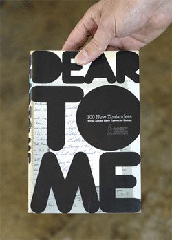
The new cover, yet I still need to edit the icons and fix a few of them because they are reading so well at a smaller scale. I have also explored a new design for the calendar which now it has taken a horizontal design but is too large of scale I will like it to still be part of the booklet.

Tuesday, March 29, 2011

In Class : Type Experiment

Research Trends Part Deux

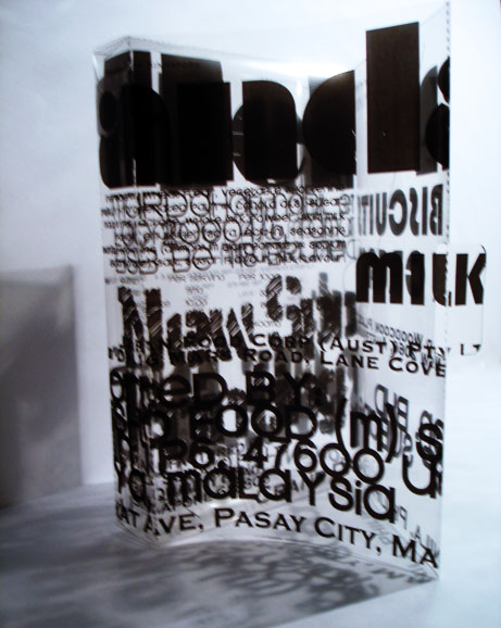
Taking a deeper closer look at the research that I gather I found that they all share a common quality which is the use of the material being paper. Paper is a very delicate material and designers have used it to crate a sense of three-simensional space and how it resides in a two dimensional space, yet with paper it gives the designer from what I gather to be expressive and keep certain delicate qualities and create a three dimensional space by stacking it up similar to a couple of designers such as Bianca Chang. Through the process of cutting out, I noticed that with my examples designers are able to not only create space but legibility by and reveling more of the letter form wether is by the removal of counters or the silhouette of the letter form. The big trend is the removal of positive and negative space through the cutting of paper. Paper cutting the oldest surviving paper cut is a symmetrical circle from the 6th century found in Xinjiang, China. Paper cutting started in China but it has evolved to be all over the world and taking various styles depending on the culture. Paper cutting is a form of silhouette which is a technique used and stencil and graffiti art. Within my research the designer attempts to create this fragile delicate material be more elegant and delicate. The places that I have been these examples have been in pop-up books such Robert Sabuda and also many of them appear in books and some environmental but they are photograph due to the fragility of the material.


My approach within my type experiments will be to create overlapping through cut out letterforms pushing the legibility yet adding light to reveal to words or a word through the shadows. Similar to what is being created through overlapping and transparency in two-dimensional material. I will like to create the overlapping of type to be delicate and contrasting and use the the architectural component in the cut out to also reveal the words.

Reading Response Triggs pg.12-17

As mentioned in the reading artist like April Greiman who created a computer generated type this was done by the use of technology available through the computer (Apple Macintosh). The start up of apple macintosh allowed for various typographical explorations. The technology that we have available allow for 3-d renderings of type, like Cinema 4, sketch up and after effects permits type to have dimension. The exploration of type in motion in recent years is more evident and they are many various designers doing various explorations. Interactive and user experience, that forces the audience to interact with the ipad or projections is more common then ever before, in this decade. A week ago, Garret Fuseiler an alumni of KCAI '08 and currently working at T2 as an interactive designer discussed the various the technology that is being develop through projections and sensor detector technology that allows for the user to use of the viewer's body to interact and therefore creating an innovative experiences. The most surprising one was the one on the magazine in which it allowed the projection on the web cam to become a 3-dimensional projection of the magazine.
As mentioned in "second order of denotation": to enhance meaning without abandoning the framework, McCoy and Cranbrook explored the relationships between image and text and playing on words and creating various levels of meaning. Jeffrey Keedy discuss the roles of the audience plays a role in reading and creating meaning or as Ellen Lupton defined it as being "narrative typography".

Friday, March 25, 2011

CNA : Carefree Nearby Activities

This is the first layout design for the booklet , the covered I decided to create a pattern using my icons. I decided to use the acronym but give it my personal twist by given it the title Carefree Nearby Activities, because they are relaxing activities for caregivers and they have to do it wether is in their house or within a block radius. The first set of pages it tells the caregiver not to feel guilty for taking care of themselves. Then they are 15 activities under the take action section. Next my idea involves given the user a set of stickers to the calendar that is folded and resides at the end of the booklet.


(sticker pages)


CALENDAR

(outside) pattern
Inside(calendar)
I still need to work on the design of the calendar(foldable calendar) and make it more unified with the booklet. I want that the caregiver, can use it and place the sticker of the activity on the calendar and remind themselves of the activity and in case they don't remember the activity they can reference back to the booklet, that is why I'm including it at the end of the booklet.

Wednesday, March 23, 2011

CNA Icons


Over spring break I developed a series of icons for the various activities that I want the caregivers to do everyday for 10 minutes or in a short manner. These activities have to be simple because they feel guilty about taking time for themselves , as well the can leave the person they care for alone. I decided on a print artifact because they don't have money and based on recent research that I have gather about these familial baby boomers caregivers the will be more interested in reading a pamphlet or book.


Different activities that I have arranged is to be in doors, above the list of activities that I have thought about are :
1. Take a 10 minute walk
2. Take a power nap
3. Make a call and talk to your friend/ on skype
4. Music
5. Garden work
6. Pray
7. Drink water and keep away from dehydration
8. Read/ meditate
9. Have a relaxing bath
10. Exercise
11.Have a healthy snack: fruits and vegetables

I been exploring the name: I been thinking of using the acronyms :

ADL: activities of daily living activities or CNA: Certified Nurse Aid. These are jargons that are used in the language of caregivers.


Tuesday, March 22, 2011

Reading Response: Compare and Contrast Readings and their application to the tailored communication approach

Reading Megg's Type image Audience discusses how cultures have evolved collective and complex systems of signs and symbols that enable its members to communicate. In this specific project in which I'm creating tailored communications for a specific group in a subculture meaning the caregivers from the familial caregivers baby boomers. The language needs to be coded within this particular community for them to understand. As the article by Katherine McCoy in Graphic Design mentioned the audience's language and level of visual literacy the skill of comprehending and understanding visual forms must be taken into account if the designer is to communicate successfully. Individual experiences shape attitudes and perceptions to create a diverse and pluralistic society. Economic status and ethnic and religious background, social background In this project through the persona in particular and form tribes within our culture. These characteristics are reflected in this project in particular with the persona, for this project I'm designing for Jane who is 63 and takes care of her ill father and doesn't take a break from caregiving yet she feels exhausted but guilt of stopping the care of her father and therefore not doing anything for herself. As Jane she has unique characteristics, my message will be specifically for her. I agree with this article and due to mass production, which companies just create a one product that suits everyone across the board. The high technology that we live in today, allows highly automated factories to tailor products specifically to individual preferences, a user-centered tailored products, communications and targeted channels to suit the culture. Kathy McCoy discusses the importance that designers and professionals need to understand their values and language and speak their language so the communication is more effective. A specialized audience possess specialized knowledge and language, effective communications can either celebrate or emphasize the exclusion of the general audience. The two other articles the Local Lingo by Alice Twemlow from AIGA voice and Pop Artist by linda Tsichel from Fast Company, they both address taking a brand in a global manner. In the AIGA article the author mentions that in order to take a brand global one needs to start local and then expand therefore having a focus audience, indicates that even a global brand needs to start with a focus need of a specific audience. Something that I noted in regards to David Butler as said by Joe Tripodi, Coca Cola's global marketing chief "It's great that when David speaks, he doesn't speak in the language of design,"it reflects that David in order to have a clear understanding with the manufacturers, bottlers and retailers he gets to their level. This reflects the importance of language and coded language and that this personal who are not designers would be able to understand him because they are not part of that culture he needs to turn to the basics.

Monday, March 21, 2011

Reading Response: Radical Type Design by Treal Triggs

Experimental type as mentioned under the chapter the typographic experiment: from futurism to fuse, Triggs mentions the importance of process and taking risks and viewing those risks as as points in the development of the overall design. Challenging accepted conventions and developing new ways of reading is a way of to altered language. Eras like the avant garde and Dada designers were experimenting in the way words, language were deconstructed. Typographic conventions are legibility and readability. Triggs discusses that experimental type design deals with design or production of typefaces and the experimental typography investigates the use of type in layouts. In comparison to the other reading type design is not just about the individual letter forms but how everything is arranged. Experimental typography is about the potential this arrangement can have and cause interest visually and create contrast. Triggs mentions the social, political, cultural context in which a typographer is operating it will affect the designer approaches experimental type. I think to a certain degree is true if there is a trend in the country or in that time but I don't think that is to a degree that is mentioned which is the final outcome of the product, a futurist era as described in the readings speed was a common theme and is evident in the type arrangements were designers arranged words in an expanding way.
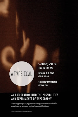
This reading in particular brought interesting points like factors that affect the experimenter in approaching his experiment. Even the introduction of new technologies affect different experimental approaches and they way type is seen and produced. At first I didn't think of the powerful effect culture played such an important role and social but looking at the examples in the book is evident that it does. Something that it was emphasized and that I began to consider and see in the atypeical symposium is that the experimental typography is not the single element of the letter forms being altered but the whole space and the overall layout. Is important to experiment even if it doesn't have a real application both readings emphasized process and learning and developing strategic points of overall design.

Reading Response: Experimental Typography. whatever that means.

For me experimental type means innovative in the use of material or breaking the conventions or set of rules in typography. The word experimental I think of a scientific experiment in which the process is as important as the final outcome, but to a certain degree of surprise will occur since the experimenter doesn't have total control of the final stage . Peter Bil'ak version of Experimental Type involves testing an idea, and the process and how certain outcome occurs. Peter Bil'ak mentions the book "The Typographic Experiment: Radical Innovation in Contemporary Type Design the author Treal Triggs in the book thirty-five different designers were asked to define their understanding of the term "experiment" they all gave various interpretations. American designer David Carson and several other designers came down to the conclusion that experiment lies in the novelty of the final or the outcome of the experiment, which I agree. Peter makes an interesting point that in this era, in which information travels really fast designers are more aware of the body of work of other designers and therefore novelty is not new, because somebody might have done it so it is the job of a designer to do through research. Peter also draws attention to Carson's comment which in regards to my opinion I feel that is true when experimentation is breaking the conventions in order to make anti-conventionalist experiments the process one uses conventional solutions. I think that depending on the material reacts can have a different perspective. For instance Keetra Dixon recently showed her work and one piece in particular such as the " I've been thinking of you for a while" the layered wax the material had a different reaction and the solutions was a conventional as cutting it out but without trying it no one will know, and it turned into a beautiful peace. Pushing legibility has been a challenge as mentioned by the reading in comparison to linguistics, typographers care about the visual component of letterforms and pushing those limits and what our physically eye can read and understand. I definitely I agree that experimentation is about taking risks and even Keetra mentioned that if that there was something she would had done is "taking more risks". One particular phrase that I found very interesting and that I agree is that we can consider an experiment in the process of it's creation. When completed it becomes part of a body of work that is meant to challenge and it has a final form can be name and categorized. Experimental process has no commercial applications, but formally it is used today by commercial giants to make their visuals more interesting.

Sunday, March 20, 2011

typography trends research

In my research I came across the blog of Jennifer Kenward, she teaches book design and experimental type at Seattle Central Community College and she had link to other great sources. Speak Up was a link and I discovered a trend that was described in article about the New(er) Typography one of the trends were the removal of counters.
then I saw it again while I was looking through Typography served:

Even the typogami which is a typeface developed for motion and the folding of paper had the same trend of the removal of the counters. This example reflects another quality how typographers are using motion and using it as a way to expand their experiment in more than one channel.

Other examples still show the removal of counters but masking images or textures is evident in these examples:


Another trend that I discovered was overlay:
Marian Banjes made the one above she is using transparency and layering which seems to be a common trend.
Even in packing as seen in this example:

Friday, March 11, 2011

Pocket Scents : Design Direction Exploration


Tailored Communications: Taking Care of Caregivers Personal Neglect

Based on the ideas that I presented last class I going to be exploring the idea of creating a planner and calling to action a daily activity that a caregiver should do for 10 minutes as a break and therefore given them a moment to breath and therefore preventing caregiver burnout. I will like to create a mix between a planner and agenda, possibly a calendar.


Tuesday, March 8, 2011

Atypeical: Freshman Poster


other explorations


Printed Poster Above (tiled)


I been working very closely with Kelsey and Joseph to promote atypeical to the freshman. I been working on the big poster and I also explored various iterations in regards to various type lock ups. I been also working closely with Vi since she developed the postcard, our goal is to create a consistent identity that reflects through all the medias. In comparison to the postcard is more informal, considering that our audience is the KCAI freshman. I took the KCAI out and wrote (43rd street and oak) to indicate the location. Based on last class critique i worked on hierarchy and tried to reflect more of the type in the imagery used in the back.