Monday, November 16, 2009

Photoshop Layouts

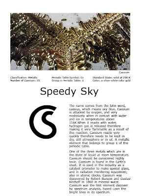
These are some layouts for the website that will be devoted for my the element Caesium:

layout_01
layout_02
layout_03
layout_04


layout_05

Sunday, November 15, 2009

seeing color: environmental harmonies


Through these past two weeks I been taking pictures of certain color harmonies, I have decided on using clothes in department stores as a way to depict the different color harmonies.


transparency


achromatic


triad

monochromatic

light to dark


opposite , complementary (red orange/ blue)


Thursday, November 12, 2009

Vector vs Bitmap


Bitmap
-The most common graphic format use on the web, except Flash.
-Bitmaps graphics are composed of pixels, each contains specific color information.

Pros
-Is ideal for photographic images where there are thousands, even millions of different colors.
-It contains the exact information (pixels) required for display.

Cons
-Can make bitmap bigger, it must allow the original image to get filled with extra pixels.there is no source of information in needs to guesstimate, then it fills the space with guessed colors.
-Any Bitmap image that has been scaled up becomes blurry.
-The "blocks" are evident --pixelation occurs. The sharpness will only be in the "original" or smaller file.
-Blurriness is obtained when you manipulate, rotate, skewing or distorting a bitmap image.

Vector

-Composed not by pixels, but instead vector: points, lines and curves.

Pros
-Through vector one can create really complex designs.
-The image doesn't loose quality-- at differe
nt sizes.
-Ideal for producing artwork which needs to presented in ideal for logos.
Cons
-Images must retain relatively simple, has a different texture, feel and when produced in detail: very little.
-Once a vector image is converted to bitmap there is no way to return to the originals state,therefore copies need to be kept one with he original vector artwork and the other one the bitmap.

Final Shapes


Wednesday, November 11, 2009

Project 3: Reading Response : TIme and Motion

In the reading Graphic Design The New Basics by Ellen Lupton , motion is a change that takes place in time. Motion can be implied or literal, any still image has implied motion or implied stasis. In animation there are several diverse ways in changing an image, such as scale, transparency, color, layer. It is important to have a style frame which serves as a template of the visual elements and their changes and things such as colors, typeface and other illustrative elements.
Implied motion: diagonal compositions or cropped elude to movement on a 2-Dimensional plane and an object centered or parallel appears to be stable and not moving.
Line: another element used to create movement a sketchy line in comparison to a very straight line reflects movement and dimensional curve lines project movement and depth.
Sequential time and connecting time and space: showing several images (rows, panels) and linking them either with a common point of connection.
Using repetition and transparency further implies movement.
Persistence of vision: the way our brain retains images and gives the illusion of movement as images appear rapidly in a sequence.
Animation Basics:
Frame: the smallest unit or a single still image.
Key-frames: are the fixed states; they are the first and the last frames of each short sequence of action.
Tweens: they are the in-between frames and allows smooth transition.
Change over time in an animation is done through the use of : changing position of an object, scale, color, shape and transparency.
Animating Type
Animating type is animated just like any graphical element but there is factors that need to be considered legibility and reading order. Words don't have to literally move but other transitions can happen such as fading in and out, flicker, change scale and color. The changes need to be down slowly to allow legibility, but need to take account that it can people will not wait for a really slow text and depending on the context it could add meaning and set the mood of the animation.
For planning an animation (just like we are doing as another element in our third project) a storyboard: visually summarize the key moments of an animation event, suggest the major changes of action. It contains notes about camera angles, soundtrack, timing, transitions, special effects.
Interactive graphics or logos are done through the use of code such as Flash, ActionScript, Java or Processing, through the use of behaviors.

Tuesday, November 10, 2009

Taxonomy Proposal

As a part of our process in creating the content for our haiku, we created a pages of marks utilizing non-traditional tools. These 30 + pages of marks , I will arrange them for this catalog in connotative and denotative characteristics. I will assemble this marks in a book 6"x9" and bound in a Japanese stab binding format in a horizontal format. I will also arrange my marks in a form of a gradient from structural to a less structural mark. I will scan my marks at high resolution and placed them on a toned paper, perhaps similar to the one I used for my mark making process. There will be 2 marks per page in which it will allow when open for 4 marks to evident on the spread in which the connection between structural and less structural mark be viewed. I will like to title my book: Taxonomy: Configuration of Form. After the cover the table of Contents will list the arrangement and there after the pages of marks will begin for even amount of spreads.
I feel that during the creation of these marks using the medium of ink and using water to toned done the intensity of our marks; is very similar to brush painting. The philosophy of Oriental sumi-e in which the goal" is not to recreate the appearance of the subject but it's soul. " I feel that with these marks the "soul" of the shape is the imprint left in the paper.
For the covers I will use illustration board cover in book cloth :


Denotative:

circle
half-circle
flat
lines
square
fan
round
twig
handle
cloth
splashes
puddles
triangles
scribble

Connotative:

moon
air
incomplete
trapped
mountains
nature
delicate
ditch
arrows
skirt
stairs
chaos
confusion

Sunday, November 8, 2009

color harmony: Munsell's depth


Using color aid I created meaningful, color harmony studies based on Munsell's Eight Basic Color Arrangements.

I used the following groupings to create "meaningful" studies:

-music -plastic
-dance -wood
-art -glass
-theater -metal


tonal progression: studying Munsell's depth


I created 9 color scores and created color representations based of Munsell's tree. I used Color Aid and my found color to successfully, create 9 vertical scores in the organization of a band.
I was unable to create the horizontal score , because I kept recreating value changes between the colors, which is not supposed to be created in this score. I'm understanding better Munsell's color theories.

Munsell Scores

1. Vertical
2. Horizontal
3. Diagonal
4. Horizontal-Cross section
5. Diagonal Cross section
6. Circular
7. Flat Spiral
8. Helical
9. Three Dimensional through Psychological Space


Tuesday, November 3, 2009

Project 3: Reading Response : The Urge to Make Things

In the reading The Urge to Make Things by Leo Lionni, in relationship to the beginning of this project. In the reading he mentions the urge of human beings to create images, even if he is not using traditional mediums such as paint, sculpture or drawing he will create images which what ever he comes across with. In the same context in this project we are using untraditional objects to create our marks. Lionni mentions the importance of the creative process and allowing for the hands and more of the gestural components of creating marks, as well as we are doing in the mark making process of the haiku we are allowing the motion, pressure, exposure of the ink on the surface and the lightness we press; are all factors of the creative process. We instructed to select several objects to be used to create marks, and as I was creating marks using this inanimate objects for creating different types of marks. These objects had a function and "life" was given to them.

Sunday, November 1, 2009

Color effects. interactions: Studying Josef Albers

Using 'found color' and some Color Aid, I created several studies that explore the color effects and the interaction of color. By creating studies of Simultaneous contrast and transparency, I'm really excited about color and the drastic changes colors have when they interact with other colors.

Simultaneous and Transparency Contrast


Simultaneous Contrast


Transparency Contrast


Itten's Studies


We created Itten's studies and created 8 small studies on a 4.5" x 4.5" each square a differnt contrast was depicted.


-Contrast of Hue
-Light-Dark Contrast
-Cold- warm Contrast
-Complementary Contrast
-Simultaneous Contrast
-Contrast of Saturation
-Contrast of Extension (equal)
-Contrast of Extension (proportional)

Images will be coming soon.

Friday, October 30, 2009

10 Objects for Haiku

1. Hand
2. Rock
3. Twig
4. leaves
5. Spoon shaped in the form of a moon
6. Charm of a moon
7. Fan ---charmed/ paper
8. Charm bi -disk
9. Thread holder
10. Charms of circles and squares

Revised List of Words for Haiku

1.Moon
2. Pull
3.Hold
4. Flat
5. Lifeless
6. Snap
7. Split
8. Twig
9. Grasp
10. Match
11. Question
12. Air
13. Fan
14. Delicate
15.Shock

Tuesday, October 27, 2009

Project 3: Haiku

This is my selection for this project:

TAKE THE ROUND FLAT MOON
SNAP THIS TWIG
FOR HANDLE...
WHAT A PRETTY FAN!

Sokan


My 30 Word list:

  1. Steal
  2. circle
  3. geometric
  4. remove
  5. pull
  6. rock
  7. rough
  8. satellite
  9. horizontal
  10. lifeless
  11. branch
  12. split
  13. pieces
  14. control
  15. stick
  16. grasp
  17. knob
  18. crack
  19. snap (button closes under pressure)
  20. hand
  21. paper
  22. air
  23. proportional
  24. fan
  25. blades
  26. balance
  27. girl
  28. delicate
  29. thin
  30. makeup

9 Words
  1. circle
  2. rock
  3. lifeless
  4. stick
  5. split
  6. knob
  7. air
  8. fan
  9. delicate


Reading Anatomy of a Visual Message

Reading from A Primer of Visual Literacy by Dondis

Representational: is what we see and recognize from environment and experience.
Reality is the basic and most dominant visual experience. All visual experience is subject to individual interpretation. Is the most effective level or way to utilize in a strong, direct, reporting of the visual details of the environment both natural and made.
Abstract:is basic elemental visual components , more direct, emotional, primitive. The removal of extraneous detail, the emphasis of distinguishing features. The reduction of multiple visual factors to only the essential and most typical features of what is being represented. Bearing no connection to any representational information drawn from experience of the environment. It can have meaning but it doesn't have to, yet the process to the simplification is similar to the process of symbolic art. Abstraction has been associated particularly with painting and sculpture as the unique pictorial expression of the 2oth century.
Symbolic:the coded symbol systems which is created by men and it has attached meaning. Ultimate simplicity, the reduction of visual detail to the irreducible minimum and it contains universal meaning. "One symbol is worth a thousand pictures."Symbols have meaning pinned on them.

Excerpt from Design Writing Research Ellen Lupton, states that perception and the reading of different shapes, objects varies within individuals based on education, customs and images.

Sunday, October 25, 2009

Study of Oppositional Pairs: A Focus on Contrast

For Color, Drawing and form the final pairings have been combined and arranged in an accordion book . I used Costco printing and I was really happy with the turn out of my images , I changed one of my pairings , from the category figure ground relationship--contrast/ minimal detection to dominant/reversible.


Friday, October 23, 2009

Project 2 : Final Statement


The final artifact has been created, an 8 paged accordion book. This book was started and it's concept is the idea of "marks". A mark: is a visible impression or trace on something such as a line, cut, dent, stain. As well as "landmarks" , because on a geographical context they mark and place , indicates a site on a boundary line. In regards to this project, lines are marks. I title the book of my book " En route" which means on the way because along the searching of the juxtapositions I found all these marks and compile them into a book. The paragraph is reminiscent of combine line study , and I wanted to give the impression of two cars on each lane of the road.
My first page it starts with an impression on the road half-grass and the other half cement. This a is a mark, the next spread is that of a progression line study and the juxtaposition is to that of a gate, in the downtown area but even a gate is an arrangement of marks and these have dents.


Juxtaposition of Progression (2nd Spread)

The other spreads included buildings, they are landmarks , geographical marks along the downtown area of Kansas City. They mark different regions the first buildings is at the beginning when the Sprint center is at the core of the downtown area. As well as a fountain located in the downtown area, is also a "landmark".

First Building
Fountain

Even close range photos emphasized on the marks, like my combine progression juxtaposition in which you have to look closely at the marks that are within the glass and as well as the bench in which it also is filled with marks. As a close up one can see that the separation between the different groves of the bench is a combination of horizontal and vertical marks.

Combine Progression , if one looks closer there are marks on the glass.

Diagonal Line study is a bench in downtown and there are marks and scratches.

The end of the book ends with a mark as well the curved line on the parking spot in downtown. Is a mark on the street ground .

Last Spread

I arrange my book starting with a basic line straight study and ends with a curve line study. The middle or core of my book is arranged with complex line studies. Through rhythm and repetitions, some of my spreads appear to have texture, tonality, just like in the readings for instance my combination of progression.

Progression line study

The above progression study almost appears to have a 3-d effect Is very interesting looking through the actual photographs and how framing and cropping had such an important role to have the juxtapositions have a more flowing transition among the pages.
The title of my book is "En Route" my photos are from the downtown area, the title reflects the many stops along my search. As I mentioned in my earlier posts the whole project in comparison to the first project the attention to digital craft.

I was planning in building a case, even though I haven't builded for this stage it will be build for my final revise version of this project.

Sequential Process

This image shows the evolution of a line which as depicted from left to right it starts as s a basic balance line study. Then the same study was manipulated using the photocopier to create a curve line study. Then I selected to only utilize the middle curve, and then trace it and then, during which I noticed the different options and utilities of the pen tool As well as the option to out line the stroke allowed me to have different variations of line weight to have more dimension. As it comes to the end , I used cropping and framing to create the curve line juxtaposition.

Thursday, October 22, 2009

Monogram for Caesium

Scher Video

After watching the film about Paula Scher as an environmental designer in NYC. She mentions the fact that in NYC they are many towns and is the melting pot of not just culture but the differences about the neighborhoods. There is a similar connection, because as NYC , Kansas City also has variations between neighborhoods. Westport is very different in comparison to the Power and Light district. In this project my interest was in the Downtown of Kansas City. She states the fact that she uses caps and tall and narrow text to reflect the city and the buildings in the city. In my cover page , similar to Paula Scher the title and the text are arrange to reflect a road and 2 cars on the road, divided by a light line line to reflect the line on the road; as well as a combine line study.

Project 2: Reading Response


In the reading found in Lupton's Graphic Design The New Basics, in regards to figure and ground relationship. In which all things have an interaction with it's surroundings and other things. As well as the interaction and activation of the white spaces and wether their space is balance or has the same appealing quality. Figure and ground relates to positive and negative interaction of space. In particular, this project Keaton and I or the first phase of this project as a collaborative project, we labeled their figure ground relationship into three categories (Stable, Reversible and Ambiguous).

For Example in these studies figure ground relationship is seen as follows:

Stable: because the line in the middle in which this element stands clearly apart from the background.


Reversible: since the negative and positive figure / ground relationship causes confusion in wether one is looking at the foreground or background. It attracts the viewer in an equal manner throughout.
Ambiguous: there is no focal point, the focus is scatter and there is no dominance or order display on this composition among the figure ground relationship.


Lupton also talks about framing and is the how we make the element standout, it divides the image from its background and serves also asa transition. In Project 2 , aside from having a 7X7 frame to arrange our compositions, the use of the camera to frame the line study that we felt that juxtaposed was essential. Cropping in which one alters and it changes the focus of the picture giving a different meaning and emphasis.
For instance I used:

Actual photograph


Final Juxtaposition
This reflects how cropping was used from the original image. As well as framing in order to fit on the spread.


Tuesday, October 20, 2009

Caesium: Font Ideas


Six typefaces that I'm considering for representing Caesium are :


Sans Serif:

-Helvetica Std
-Gill Sans Std
-Avenir Std

Serif:

-Arno Pro
-Garamond Premier Pro
-Kepler Std

Monday, October 19, 2009

Paper Studies : Interaction of Color --Studio Practices

Today in studio, the objective was to see the interaction of color, these relationships between color change between colors. Using my found color collection, I created 3 colors to look like 4 and 4 colors look like 3. Here are some examples, that I did during class:

3 looks like 4


3 looks like 4


3 looks like 4


3 looks like 4

4 looks like 3