Sunday, February 28, 2010

seven virtues

"Flowers are a perfect replica of human life" . . . . planting . . . growth . . . . bloom . . . . withering."This project I have decided to use flowers and their symbolic meaning in representing each of the seven virtues which are:

chasity:white lilly or queenanneslace
charity: tulip and a moss
temperance:azalea
diligence: red clover
patience: aster or daisy
kindness: flax or elderberries
humility:blue bell or the white rose
I been looking at several different ways to photograph the flowers. I been looking through several of fine artist and photographers such as Georgia O'Keffe , Andy Small, Tony Howell and Virginia Sanders.


tulip: charity


white lilly : chasity


temperance:azalea


diligence: red clover
patience: daisy


kindness: flax


humility: white rose


I was able to do some test shots and I decided to use a white background and having interaction with more than just one flower and if it is , for example with chasity the flower needs to be closed.


Thursday, February 25, 2010

linear process for the stiletto

little black dress and reflection

Final title: Little black dress

After more revisions , tomorrow I will present 9 icons , and here at the final vectoring of these icons at 4 inches and 1 inch size.

lipstick
perfume

full length mirror


black dress
stiletto


clutch
hanger


rose
brassiere


At .5 inches in height all together in a line:


After looking at the group overall I like the overall design of them and I think that by inversely arranging the colors black and white , in comparison to my principal idea where it was more white than black. By darkening the main area allows the shape to have more weight and be less flat. There are things that I still need to work on such as the spacing, the tassel on the perfume bottle I still don't like how it looks. The rose also in comparison to the rest of the group is the least heavy.

Wednesday, February 24, 2010

little black dress icons geometric approach part III

The panty hose didn't work with my set and communicating clearly the object that is suppose to be. Refinements have been made and the set that I really liked is the one that is inverse from my previous design, because I been trying to fill the dress but it stands out more the rest of icons and becomes an anomaly. I feel this set works better as a set and I also had Andrea Morrris (Mo) a junior in Design, to look at my icons and fill out a set of questions that dealt with several points such as legibility, cohesion, form, craftsmanship and wether the story could be figure out for the set of icons.


refined icons with a light stroke

refined icons with a heave stroke
refined icons filled


refined icons with inverse of white to black


Mo's Comments


legibility is working but the only one that I'm having troubles
is communicating the rose


I showed her the other set and she felt that these were the most cohesive as a group.
She indicated about the heel of my shoe and one of the strokes being to small for the overall space that it took. There was a single line on my purse and that is the only line independent in comparison to the set. The rose she had doubts wether it was a rose or an ice-pick.


edited icons based on Mo's comments


A SPECIAL THANKS TO: 'MO' thanks for your comments and criticism

little black dress icons geometric approach part II


The necklace as in my last post, didn't make the group cohesive. Is not working and therefore it was taken out and it won't be part of my final set of icons but new objects were included which are:

-bra
-panty hose
-rose

bra


panty hose


rose

I feel that the panty hose does not communicate panty hose and that the rose needs to be simplified.

Sunday, February 21, 2010

change one thing: feel and survive posting and uploaded to AIGA


The poster for the 2010: Poster Clash competition I have finally submitted it. This is the final poster and the submission to the AIGA Blue Ridge website.

Saturday, February 20, 2010

reading 04: generate and cull

In the article Generate and Cull about the design strategy to generate a wide range of solutions and then through a process of selection pick the one that works best. In regards to this assignment it was necessary to create several solutions and different ways to come out with the best icon. In the stages of processing ideas working on quick material allows you to generate a large number of solutions, during this project I used tracing paper allowing me to quickly trace core the general shape of the object and therefore keeping the main characteristics of the shape and yet allowing manipulation.
As listed in the article there are benefits when one works with generating and culling during the creative process and also that I felt that I have used during the creation of these group icons as well as the
1. Work through a number of ideas fairly quickly: using tracing paper it allowed me be quick during the design process.
2.Compare and contrast the strength and the weakness: looking at the different range of the designs I created to pick the best one.
3. Taking chances and less predictable safe choices: I still really need to work on creating more interesting designs I feel that the direction that I'm going is definitely a different approach and specially in regards to the feminine objects and using geometric and hard edges adds a different feel to the overall designs.
Above shows through generating and culling is an effective to come up with an interesting design

Friday, February 19, 2010

project 2 experimentation with type


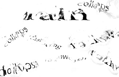
I'm creating a series of typographic compositions to communicate 4 separate weather phenomena. I have chosen : thunder/ rain/ shadow/ day

Here are some examples that I created through several different techniques such as light, cutting out, charcoal, scanning, and other approaches.


Change one thing: feel and survive editing


This project is really close to being submitted to the AIGA competition , I have created different iterations for the text and it's layout, as well Jaime brought to my attention that the woman that I used for my poster is the woman in the movie Psycho. She focus my attention in the different connotations people might receive for my poster so I have decided to do same collage with a different woman.


little black dress icons geometric approach


the necklace I feel that is odd in comparison to the group and it doesn't feel the same weight as the other objects. I like the direction that I'm creating my icons in a geometric style with a twist.

final the constructed image of marilyn monroe

I was able to finally obtain an hourglass and a typewriter to write the quote and make it look more realistic than I did on my first design. I have added a new index which is in the bottom , is a photograph of her famous white dress.
I used an composition that required overlapping which I was inspired by the synthetic cubism and is relevant in regards to Marilyn by her complexity and the different layers she had. The hourglass is to depict time in regards that she has die as well as a symbol of her curvy body and the way she was known while dating Arthur Miller. There is a man applauding in the background as an indication of her being a sex symbol. The script Some Like It Hot which she played a role in. The diamond necklace not only represents that the famous song " Diamonds are girl's best friends" but also to represent her death and her inability to find happiness and everything because she thought that the concept of an actress was greater than being one as explained in the quote. The script above are excerpts of a screenplay but they were carefully selected where they describe tardiness and over sleeping which it was an index of Marilyn monroe on movie sets. The red lips as a symbol of her and to describe her sexuality. The use of a golden lighting is to depict a time period as well the vibrancy of the Hollywood lights.

Critique:
After critique , it was emphasized the fact that I didn't use other symbols or index that were not cliches of her. That I should have tried to depict a different aspect of her life. I also noticed during critique that I should have used different type of lighting and different arrangement of the objects and more overlapping to create that "cubist" feel that I was first trying to depict.

Thursday, February 18, 2010

F&S: icons


I came across a site : http://www.iconwerk.de/index.html in which they create custom icon designs for different companies. Browsing through this site I came across a couple of icons that they have design and a couple of things were very similar in the process and the creation of my own icons.

In this example they redesign a set of icons for the the relaunched Fine Cooking Magazine and they are meant for this magazine's content on print and on the web. I personally don't like the bright blue color, the background's intensity with the pictogram. The selection of the designer though it was chosen to keep with the magazine's color brand.

Fine Cooking Magazine

Through out the creation the designers kept in mind the same visual language.
In regards to the corners, cuts and lines have the similar values (as shown above).
Similar in my own attempt to keep a consistency so all the pictograms have the same visual language.


Final Set of icons

AOL website icons

They also developed the 30 icons for the AOL website yet as shown below they have reduced the scale of it , similar to the way that we have been designing our icons in a bigger scale and scaling them down, to see wether their legibility is still clear when used for instance in the web, just like these icons are mainly meant to be used for.
AOL icons reduced 16x16 px


I agree that in the creation of icons, simplicity and clear understanding of the shape allows for a wide range of group , and in a visual language overcoming the barrier between languages and unifying nations into an universal language.